


I’m currently working on a dark series of paintings featuring the Kingfisher Bay jetty at night and very early morning. Above is the first one in the series which I previously shared with you. The others will be done over the next month or so.
Painting night subjects or other low-light subjects presents unique challenges. Here are some tips for painting them effectively:
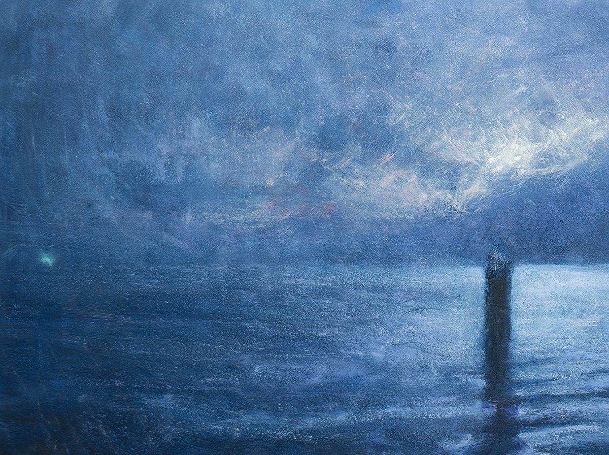
- Start with a dark foundation. You must set the stage for the highlights. Remember, painting is all about contrast. For the lights to pop, they need a strong, dark foundation to work with. In my Three Pylons painting, a vast majority of the painting time was spent establishing a dark foundation, and I held off on the highlights for as long as possible.
- Lean into the idea of the subject. If painting the night, could you make the colors darker and cooler? Vincent van Gogh did this with many of his night paintings, with his swirling, rich blues and yellow stars.

- You’ll be dealing with reduced clarity, so lean into the soft edges. Save the hardest edges for areas around any light sources (street lamps, etc.).
- Value (how light or dark your colors are) will do most of the heavy lifting. Focus on getting the values right first and foremost. Then consider using temperate contrast to add a bit more flair and drama. Local color will play less of a role.
- Get comfortable with grays, browns, and low-saturation colors.
- Don’t overdo it with the highlights, even if you’re painting direct light sources like street lights or the moon. You want them to have a soft glow rather than smack-in-the-face brightness. Below is a close-up of my Three Pylons painting. I’m fairly certain I didn’t use any pure titanium white for the highlights. They are mostly pale yellows, reds, purples, blues, and greens.

- Taking an honest photo of low-light subjects can be challenging. They tend to be underexposed in dark areas and overexposed in light areas. They also ignore many of the subtle and wonderful color relationships that really make the subject what it is. Keep this in mind as you paint. You may need to compensate with your colors. For example, if you know the reference photo is underexposed in areas, you may need to bump up the lightness of your colors.
- What were your first impressions of the subject? What was your experience? This should form the basis of your painting, with any reference photos and studies serving more as guides and reminders of your first impressions. The morning of the Three Pillars painting was cold, quiet, and eerie. There was not another person in sight, and all you could you could hear was the water rippling with the breeze and the erratic splashes on the water’s surface as pelagics hunted the baitfish. This is what I wanted to convey through my painting.
Happy painting!

Dan Scott
Draw Paint Academy
Dan Scott is the founder of Draw Paint Academy. He’s a self-taught artist from Australia with a particular interest in landscape painting. Draw Paint Academy is run by Dan and his wife, Chontele, with the aim of helping you get the most out of the art life. You can read more on the About page.


