


Morning class,
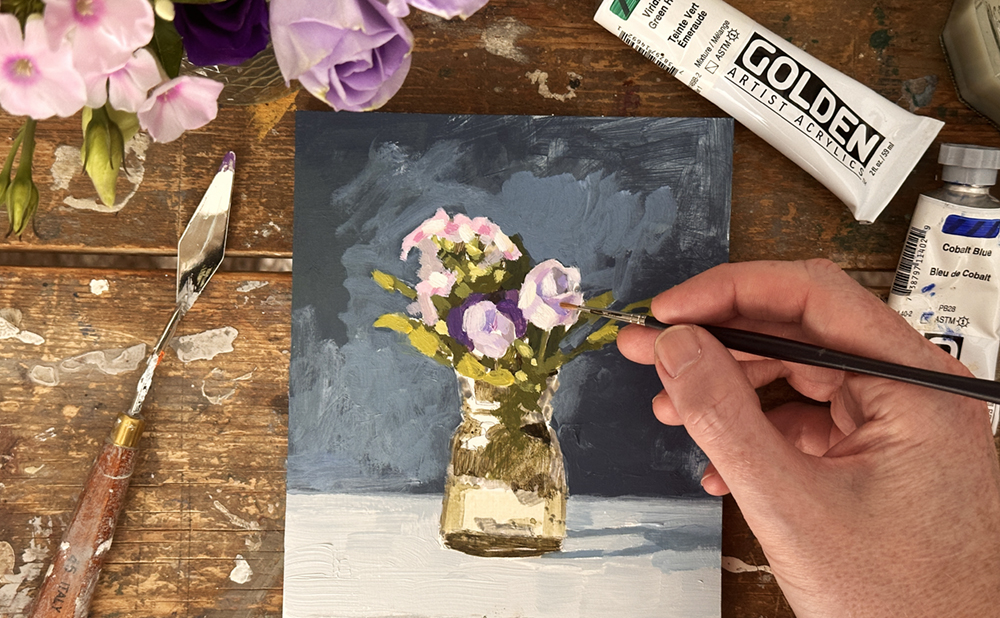
Before starting a larger painting, I almost always create a “postcard” colour study.
This small-scale version helps determine if the concept will work at a larger size and provides a roadmap for the painting process.
These simple studies allow you to plan composition, colour balance, and value structure before committing to your final piece. Solving problems at this manageable scale gives you confidence and clarity before investing time.
Think of this as a visual test lab for experimentation and discovery. Although painting the same subject twice may feel like a waste of time, the insights from a quick study help avoid frustrations that can emerge later on.
Downloadable Reference Image for the Painting:

Click here for a larger 8 x 10 inch reference image (opens in new tab)
Materials you will need:
- 4 x 5 inch (10.16cm x 12.7cm) canvas board or canvas
- Palette Knife
- Pencil or Acrylic marker to draw out
- Small round brush
- Flat head brush for painting the background
Acrylic Paint Colours
- Titanium White (Golden Paints)
- Cadmium Yellow Medium (Winsor & Newton)
- Quinacridone Red (Golden Paints)
- Cobalt Blue (Golden Paints)
- Cobalt Violet Light Extra (Old Holland)
- Burnt Umber (Golden Paints)
- Raw Umber (Golden Paints)
- Viridian Green Hue (Golden Paints)
Drawing Out
I’m working on a 4 x 5-inch canvas.
The surface is a smooth, moisture-resistant MDF (Medium Density Fibreboard) board.
The board has been prepped with a couple of coats of GAC 100. This helps prevent ‘SID’ support-induced discoloration. This is when impurities in the support or board are drawn up into the paint film, causing discoloration.
Pro tip: Try to get an MR (moisture-resistant) MDF; Medite is a good brand.
Golden Paints also recommends the Gloss medium for this.

I then primed it with white acrylic primer and sanded it down with 120-grit sand paper, so it has a pretty smooth surface.

I’m using a mechanical pencil for the sketch.
This is a 0.5mm HB Kuru Toga Roulette pencil from Uni. It creates a consistent, precise line for your initial sketch.
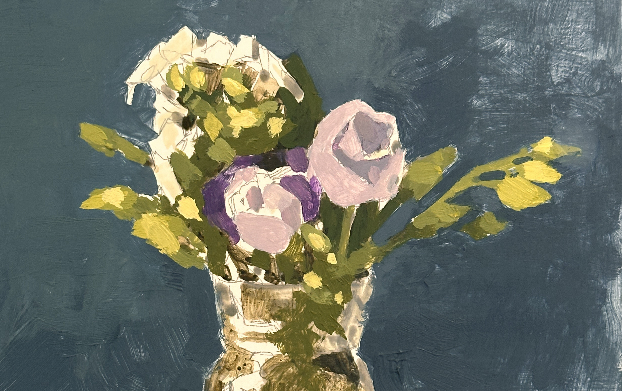
While drawing out, I found the top left-hand side of the subject (the clusters of leaves) more challenging to capture. This is perfectly normal. Sometimes, complex elements don’t always translate to smaller canvases. Take your time with these sections.
It was really interesting how the flowers had many different value changes and colour changes, as well as planes of different shapes. If you start your sketch with the flower heads, they will seem disproportionately small on your canvas. Don’t be too harsh on yourself until you’ve sketched the complete composition, including the base of the vase.
It’s only when you add the vase that everything falls into scale. What initially feels too small suddenly reads correctly as a bunch of flowers once you establish these relationships.
Blocking in values with Acrylic markers
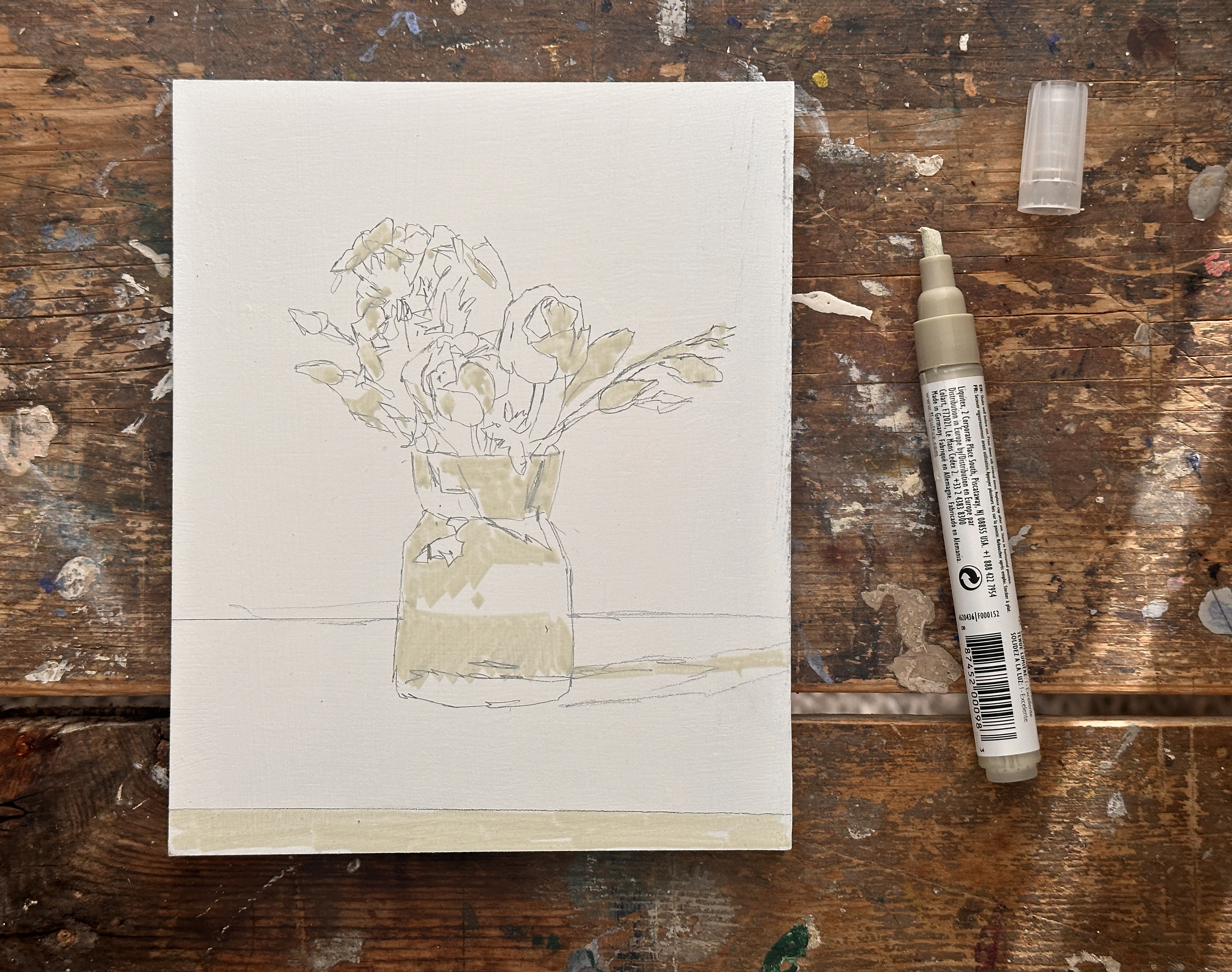
I find acrylic markers great for sketching out values, especially if you’re making the transition from drawing to painting. “Painting” with a marker is a nice way to build confidence. I start with a fairly light colour (called parchment) and can then build on that with progressively darker values.
This Liquitex acrylic marker has a chisel tip, so I use it on the side to create solid blocks of colour. This can be handy to try and see how the values are working and get a feel for how the light fall is working on the objects you’re looking at.
If you’re struggling to see how the values are looking in your colour image
If you’re struggling to see how the values are looking in your colour image, you can use your phone to change the image to black and white.


There are different apps that also give you more options for judging values, but your iPhone can give you a quick guide.
You can print a black and white version if you’re working from a printed-out reference.
Using light logic
When sketching and using a single light source, it can help to think about light logic. Logically, where would the light be coming from, and where would the shadows fall?
If it has a shadow on the right-hand side, the light will come from the left side. And then that will dictate how you turn the form of all the flowers. So they’re always going to be darker on the right than they are on the left-hand side.
It’s worth mentioning that when setting up a still life, I’ll often look at the cast shadow shape first to ensure it looks interesting and doesn’t throw any strange-looking shapes. You’ll find that anything in your reference photo that looks a little odd tends to be amplified when it’s turned into paint.
Value 5 Acrylic Marker
Now, I’m going to introduce a slightly darker value, this time with another Liquitex Paint Marker, Neutral Gray 5, a mid-tone value.
I’m jumping my eye around the scene with the value 5 pen and looking for where there’s that mid-tone going into the shadow.
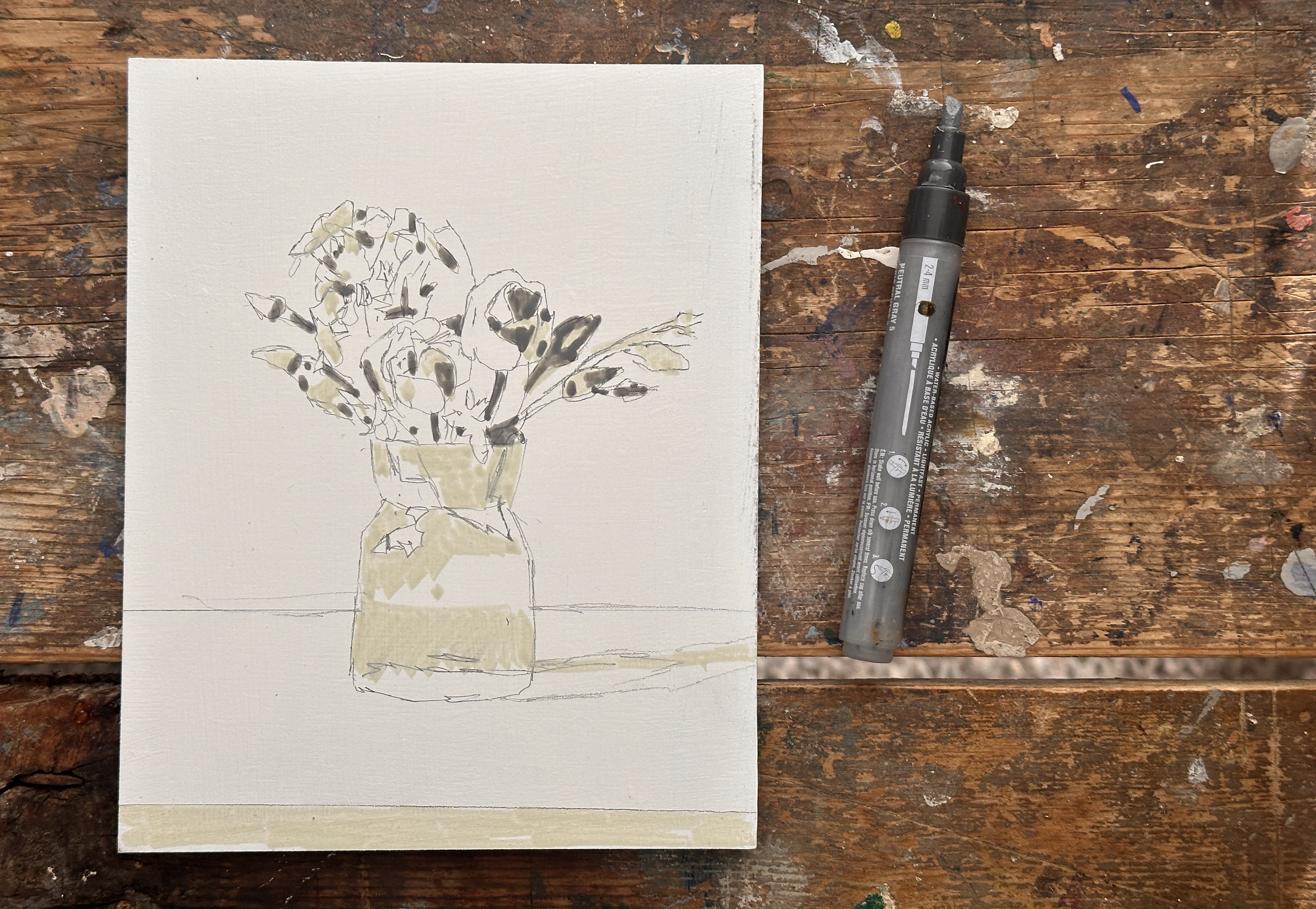

You’ll notice there are lots of little marks.
This will help you develop an impressionist pattern in your painting practice. Your painting should have lots of variety, adding interest and moving the eye around it.
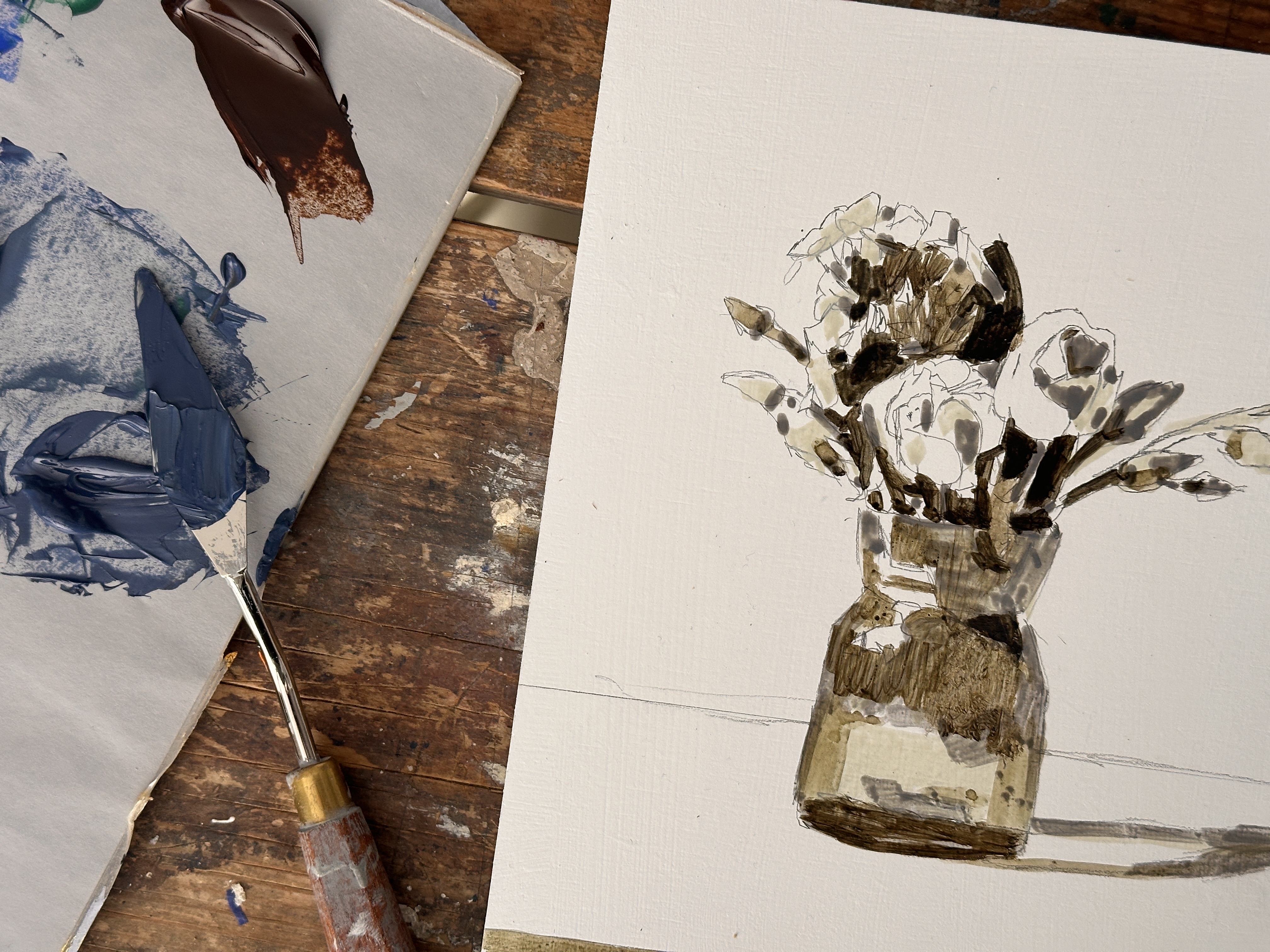
At the moment, it looks like lots of disconnected shapes. Once I’ve got the value 5 and the initial lighter drawing down, I’m going to paint in some darker values, so I’m swapping to a small round brush and using some high-flow acrylic.

High-flow acrylic paint is manufactured at a thinner consistency yet still maintains good coverage and opacity. If you started with heavy body paint and then diluted it with water, the paint would be more translucent at the same viscosity.
I’m concentrating on the areas that would be green and putting those in the shadow. This gives us a good base from which to judge those shapes. When I’m happy with the darkest areas, I can dilute them with a little water and apply like a watercolour wash.

Once I have the initial sketch laid out in the values on the pot, I mix up a colour for the background.
Painting the background
The background is blue with a turquoise/green tinge. You could mix it with a range of different blues, but I’m using a mix of Cobalt Blue, Burnt Umber, Titanium White, and some Viridian Green hue.
Anyone who’s followed along with the Monet Landscape Course will see how handy Viridian Green can be, adding that vibrancy and turquoise shift to your blues and greens.
I’m using a palette knife to mix the colours. It’s from a brand called RGM, size 45

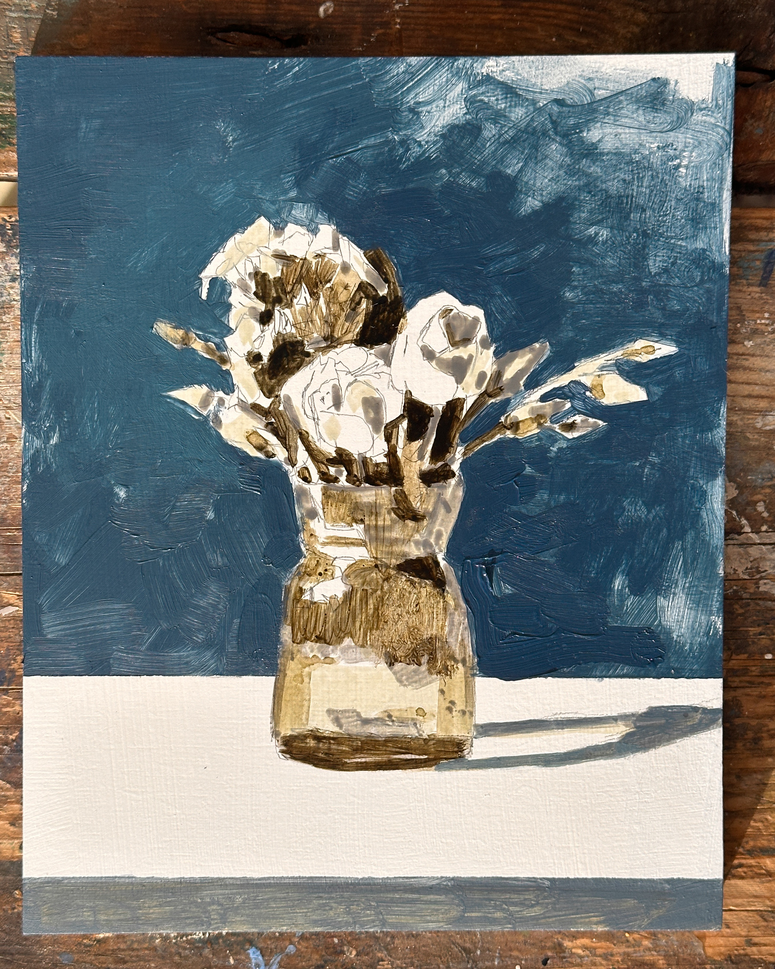
It’s lighter on the left, around the smaller flowers, then darker on the right-hand side as it goes into shadow.
Adding a simple line at the bottom of your painting can suggest a tabletop edge and allows more contrast. This prevents the composition from floating in white space and naturally draws the viewer’s eye upward to the center of your frame.
Mixing green basetones
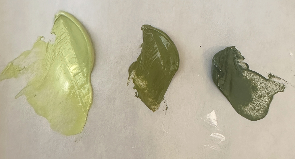
For painting in the greens, I mix three base tones.
For the darkest mix, I start with Cobalt Blue, Cadmium Yellow Medium and Burnt Umber.
The umber helps to take the green intensity down, still keep a nice earthy colour.
For the mid-tone, I added some Cadmium Yellow Medium to lift the value and a little Titanium White to cool the mix.
For the lightest greens, they go a lot cooler. So I add a bit more yellow, a bit more white, and then a touch of Viridian Green. This will get that nice, mint green.
I start with the two darkest green mixes.

Then, paint in the lightest green.
I can intermix between the base mixes, looking for the pattern between the colours and values.
Mixing purple hues for the flower heads
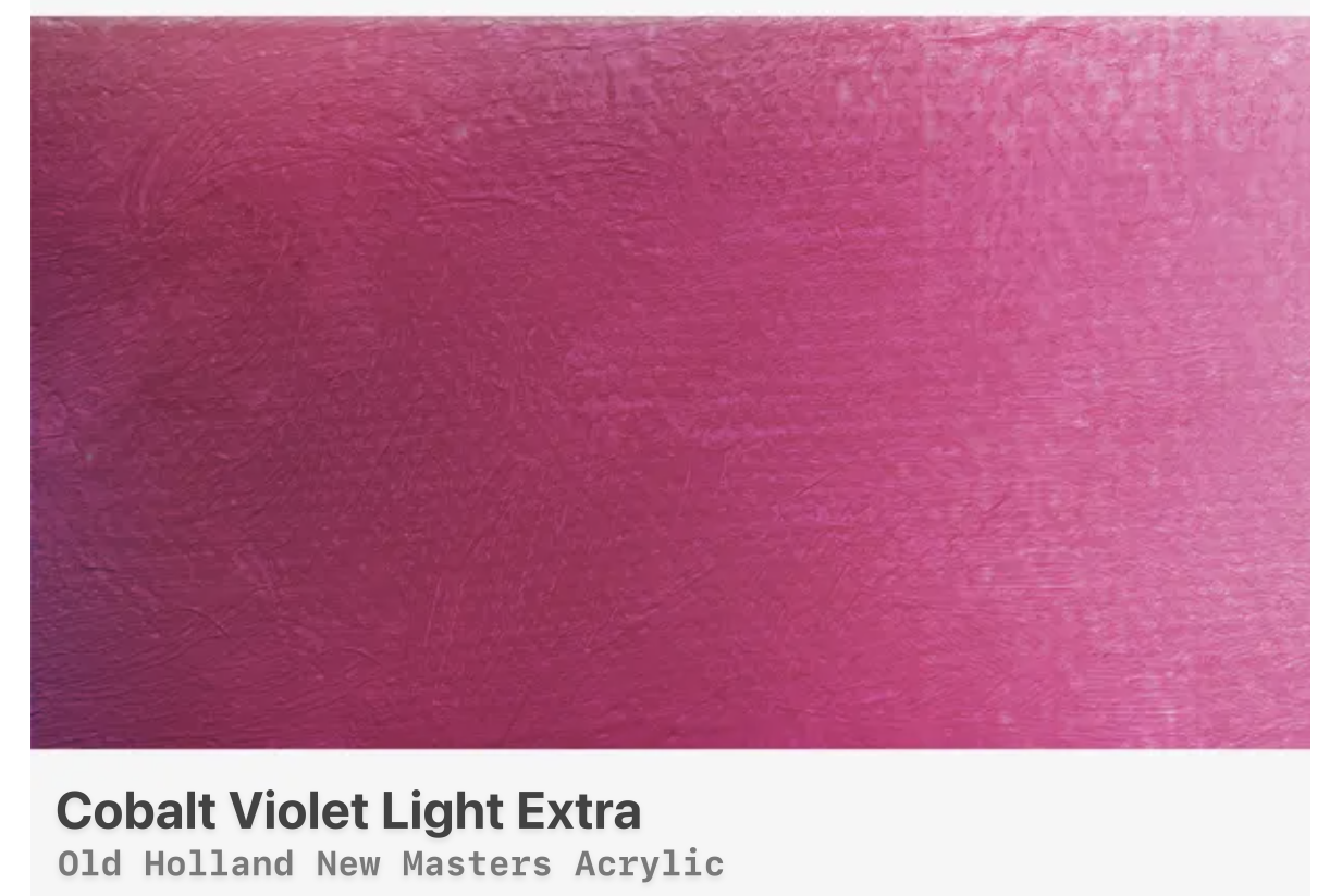
I’m using Cobalt Violet Light Extra from Old Holland for the Deep Purple.
Mixing this with the Cobalt Blue creates a lovely deep purple. (You could even have a bit of Ultramarine Blue because it’ll be a darker value to get that deep colour).
For the next base mix, I add more of the Cobalt Violet Light, which goes more towards red, more towards a crimson colour than violet. Then a touch more for the lightest mix, and a little white.
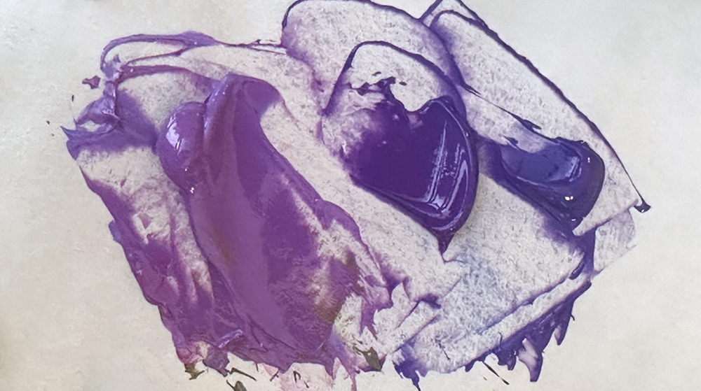
I start to wash these into the main areas of the flower head.
I’m using a small round watercolour brush. For the tiny flowers on the left, I added an additional touch of Quinacridone Red for the pinks.
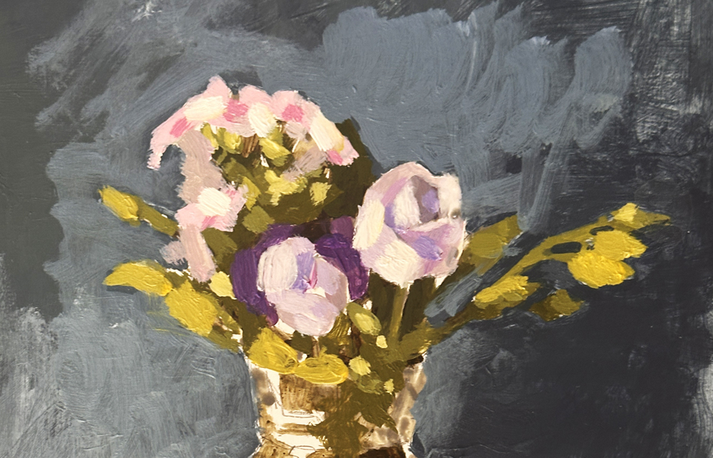
I played around with the background, tweaking the values to see what felt best.

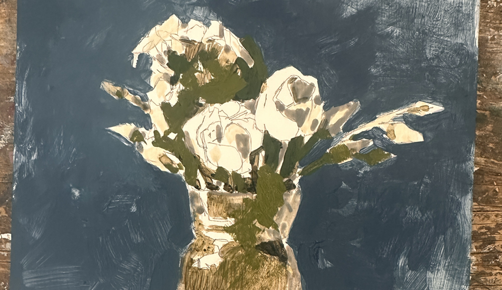
Here’s the finished study. I hope you enjoyed it, and let me know how your painting turns out.


